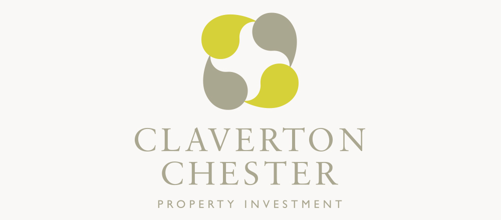

Claverton Chester are a new Property Company based in Chester. ZED Creative was asked to create their identity, the brief was to keep it simple, the use of a serif font and not break any moulds. The device itself is made up of four highly stylised leaves arranged in a circle. The actual leaf form becomes almost unimportant as the shape of the device takes on a form of its own. In design, the starting point does not always lead to an obvious end point. In practise, the device for Claverton Chester primarily needs only to work as a recognisable shape with it’s associated colours, how it came to be is almost irrelevant.